 |
| Bingling Si |
Monday, October 15, 2012
Bingling Si, Qinghai Province, Hexi Corridor
This hard-to-get-to temple outpost primarioy from the Tang period yielded some great landscape shots.
Dunhuang: Black-and-White
This is a link to the black-and-white photos from the Dunhuang area this year. These are candidates for palladium printing when I get back to California.
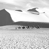 |
| Dunhuang Black-and-White |
The Cormorants of Yangshuo, China
I've been posting most of my new pictures to PicasaWeb rather than here, but I will at least include links here. This link is to the Cormorants album.
 |
| Cormorants |
Sunday, October 7, 2012
Along the Hexi Corridor: Tongren
Here are some new images of Tibetan Sites in China.
 |
| Rongwo Si, Tongren, China |
Saturday, September 1, 2012
Just Arrived in Xi'an
So look for more images from China both in Palladium and in Ultrachrome, especially from Tibetan enclaves in the China and along the Silk Route.
Sunday, August 12, 2012
Still Time to Visit Contemplative Spaces
The show will be coming down the week of August 20th, so there a few more days to stop by and enjoy the display space which was once a part of the Claremont Gallery of Art but which now houses the Pilates Studio M. Check for hours here.
The show is designed to be seen, but each print is available for sale at the Studio and can be picked up on the 20th. Check with Maria Bernhard at 323-632-2386 or 909-625-3333 or email at info@PilatesStudioM.com. The Studio's URL is www.PilatesStudioM.com
Each 16" x 20" framed color print is available for just $175; each palladium print: $200. Each color banner scroll (27.5" x 65") also $175.
There are several "Quad" panels available for more; many smaller 8.5 x 11" matted but unframed prints still available for just $35. These have been printed on a variety of fine arts papers. Check the blog here and here.
The catalog can be purchased for $20 online or at the Studio. An intriuguing option is to purchase the catalog as a eBook for the iPad for just $4.99.
Check out the Foothills Magazine review of the show and also some of my efforts to provide a home-grown audio tour and QR codes to key links about the show.
Friday, August 10, 2012
A Second Palladium Candidate

The two prints were made from scans of the Rollei 120 film negatives. I've printed them using both Photoshop and QuadTone RIP. The Fine Arts papers now have printer-specific icc profiles, so even black and white prints well using PS. But the QuadTone drivers and curves are really excellent. It's possible to add just the slightest hint of sepia, just enough to warm the print yet remain true to the source.
The Rollei optics still amaze. The slightly-out-of-focus driftwood in the left foreground suggests depth and contrasts with the crip focus on the upper right. Even the 400 film provided a wonderful tonal range. Also, the analog film is quite forgiving.
Back to Black and White

Contemplative Spaces will be up until August 20th, but it's about time to return to black and white. This driftwood assembly from a recent Yosemite trip was photographed using my venerable Rolleiflex. I thought I had 100 ISO in the camera and exposed accordingly. But when I removed it, I discovered it was 400. So I had Swan's "pull" it 2 stops. It worked! Even with old film stock, estimating exposures (I didn't use a light meter), and the pull, many of the prints turned out great. I've printed them on Montvale Acquerelle, a photo-canvas stock and on Epson Enhanced Matte. The two driftwood images are candidates for large palladium prints soon.
Tuesday, July 31, 2012
Foothills Magazine Article About the Show

I was delighted to see a short article in the August Foothills Magazine about the show. I excerpt it from page 10. The link to the full PDF article is here. Many thanks to Don Sproul for covering the show.
(Click on the article to get a better view. You can also enlarge the image using the "Control +" function on your browser. The text is quite clear if you do.)
Tuesday, July 24, 2012
Show Extended
I'm delighted to say that the show has been extended well into August. There will be another First Friday opening (better, "re-opening") August 3rd, with the aerial show at about 7:30. Look for some new prints. Those who have bought prints should be able to collect them before the end of the extended show.
There are unframed prints available, too, as well as catalogs, available at the Studio or at Blurb. The prints made on fabric are one of a kind, so now is the time to purchase one of the remaining ones.
There are unframed prints available, too, as well as catalogs, available at the Studio or at Blurb. The prints made on fabric are one of a kind, so now is the time to purchase one of the remaining ones.
Wednesday, July 11, 2012
Testing Video
With the iPhone 4, HD-quality video became widely possible to do. (Editing, of course, is another matter.) So I thought I would take a short video of the layout of the show, edit it on my iPhone using iMovie, and publish it using YouTube, TwitVid, and Tumblr. YouTube remains the standard, TwitVid works well. Tumblr took a long time to upload, though. The link uses YouTube "embed" feature.
Monday, July 9, 2012
Hours
The Pilates M Studio is open during the week for viewing. The best hours are 8:30 to 2:30, but you might want to text Maria Bernhard at 323-632-2386 to make sure or make an appointment. I plan to be there about 1:00 on Tuesday, but the studio will be closed this Wednesday after 11:30, so NO Webinar at 4:00. I'll post updates on the best times to view the show, so look for them on this Blog.
The First Friday Opening...
The natural light in the late afternoon provided great illumination for the prints. When the sun went down, the studio lighting provided excellent, warm illumination. Thanks to all of the many friends and acquaintances who stopped by. I enjoyed the conversations very much. Thanks also to David Shearer and Maria Bernhard who made the opening a warm and an aesthetic occasion.
Friday, July 6, 2012
Today: July 6th at 6pm -- Show Opens at Packing House
Dust off your calendars. Today's the day. Follow the signs to the Pilates M Studio in the Packing House, West Claremont, 1st Street, just West of Indian Hill. Show opens at 6 pm and I'll be there. Parking will be tight, but there should be some places open near the top of the parking structure.
This show is part of the First Friday Art Walk, so check out other shows in the area. There's a 7:30 aerial show on the "silks" on the schedule, so stop back then.
Check the archives of this blog for more information about the catalog, themes, and details of this show. See you there!
Sunday, July 1, 2012
Show Webinar: An Invitation
The show has an opening, a catalog and an audio tour, so why not a webinar, especially for those far away who can't make it to the show during the month of July? The proprietary "Webinar" is pricey, but Skype permits video conference calls which are quite competitive in terms of quality and features and yet is free. So I propose a Skype conference on some of the items in the show from the perspective of the photographer.
If I can find a good wifi source at the gallery, I'll broadcast from there using my iPhone. Otherwise I'll broadcast from home on July 11, Wednesday, at 4:00 pm PDT. With Skype, each participant can call up pages on his or her browser, so it will be possible to direct you to particular images on the web while we speak. If I'm at the gallery, we can look at the actual prints.
I suspect that there's a practical upper limit of the number of participants, especially if we are all using video, so the plan is to limit the first webinar to the first six participants. So if you are interested, sign up by emailing me (or commenting on this posting on this Blog) of your interest and giving me your Skype username. I'll create a group and let you know of the status of that group. If for some reason there are more than 6 interested, I'll schedule another webinar. My Skype username is "Carharty". I'll keep the first meeting to about a half-hour. It will be informal and mostly questions and answers after a few comments and we get going.
I'll initiate the conference from the group I will have formed of the the first six respondents. Make sure your Skype in installed, configured and functioning. If you have your Skype open and ready, you should be hearing from me at 4:00 pm on July 11th. (If you are in town, don't forget the opening on July 6th!)
You can tell that I find these new possibilities intriguing. I've been a museum buff almost all of my life and have always hoped tools like these would come along!
PS Facetime would also be great to use but currently it supports only 1-to-1 video conferencing.
Thursday, June 28, 2012
Invitation Image as a Poster

The first show poster used a misty monastery courtyard as a background. This image is perhaps more of signature image for this show.
Link Center Poster for Show

I wanted to provide an easy way to use the Scanlife logos to access key links -- the audio tour, to purchase the catalog (or look at it), and to this blog.
Wednesday, June 27, 2012
The Audio Tour Menu

This can double for the Audio Tour Menu. It's linked, so you can try it out. It may look different depending on the device you are using to browse it.
Tuesday, June 26, 2012
Audio Touring with your iPhone
Rather than to try to associate individual sound files with a bulleted list, I think a better way is to link to the the list of files on Audioboo. They've made is pretty easy...http://audioboo.fm/jcmanley.
There you see a list (most recent at the top) of audio entries about the show. If I use the Scanlife logo to connect to the above URL, then the list of audio tour files is pretty readily seen. In fact, it looks better on an iPhone than on the PC. So I'll take the next step, create a logo, then place that on a poster with instructions near the beginning of the show. The result will hopefully be an economical audio tour on smartphones.
Maybe to liven things up...
Experimenting with Audio Touring...
There are a variety of guide-by-cell-phone services that are available, but most charge at a rate that you would expect. I've been wondering whether one could replicate a cell-phone-like service at a temporary exhibition. Partly the issue how much time do you want to spend dialing, entering item numbers, etc. One good way to do it would be to put a scanlife logo on each label. Voila! anyone with an iPhone could go directly to a sound file featuring that item. But multiple logos means a monthly service cost to support multiple logos. But apps like Audioboo might be just the ticket.
It's possible to record a short sound file for each gallery item of interest. That tiny URL might be a part of a bulleted list on this blog. A logo would direct the iPhone user to that specific blog page. The user could then tap items in the list and listen to the accompanying audio. One could make the bulletted hyperlink entries quite large so that it would be easy to see and tap them. An example follows (though not large).
It's possible to record a short sound file for each gallery item of interest. That tiny URL might be a part of a bulleted list on this blog. A logo would direct the iPhone user to that specific blog page. The user could then tap items in the list and listen to the accompanying audio. One could make the bulletted hyperlink entries quite large so that it would be easy to see and tap them. An example follows (though not large).
- 3D Anaglyphs in the Show
- About the Palladium Prints in the Show
- About print #106 in the Show
- About "Inside Shang Si"
- etc.
Invitation: Contemplative Spaces
You are cordially invited to the opening of my new show July 6 of Palladium and Ultrachrome prints at the Packing House in Claremont, California. The Title (and theme) of the show is Contemplative Spaces. It includes recent color prints from Tibetan areas of China as well as black-and-white Palladium prints that have not been shown before and also 3D anaglyph images printed on paper and fabric.
The show starts on Claremont's "First Friday" Art Walk in July and runs for the month of July. It is located in the Packing House on 1st Street in West Claremont. Come anytime after 6:00 pm on that Friday. Pilates Studio M will host an aerial show at 7:30. If you have enjoyed performances on the "silks" at Cirque du Soleil, you will enjoy this half-hour performance.
There is a catalog available at the show and on Blurb which features an iPad/iPhone eBook version. The prints on display are available for purchase, as are full-sized and letter sized unframed versions of both . The gallery hours during the week are in the afternoon. The show will be up through July.
Best,
Jim Manley
Sunday, June 17, 2012

Using the SCANLIFE Link Logo

I've been intrigued with the SCANLIFE iPhone and iPad linker since I first saw it in use in New York last October in the vicinity of Ground Zero. The beauty of the logo is that it can be scanned with the Scanlife iPhone or iPad app and it will take you to a URL address. No need to try to type in a long URL. The URL can provide more information about the site. This is a natural for outside museum displays; also, for in-museum displays. The number of links you can use for free, however, is limited to three.
I've included this logo on a poster at the show. The associated link takes you to the Blurb purchase page for the show catalog.
What is especially cool, I think, is that you can elect to purchase the eBook version and immediately download it to your iPhone or iPad and open it in iBooks. Right on the spot! The logo works onscreen as well. Try it and see. No obligation.
If you are viewing this post with an iPhone or iPad and don't have the Scanlife app, go directly to getscanlife.com, download and install it. Then scan the logo above with it.
Also included in the lower right corner next to my name is a second Scanlife logo. This one takes you to this Blog.
Friday, June 15, 2012
Printing on Fine Art Papers II
Canson has produced a variety fine papers for modern printing. Most of the following have had a long history before the ink-jet printer, including the Arches Platine Fiber Rag which existed in the time of Leonardo de Vinci. I use it now as the best medium for my palladium prints. It is available from Daniel Smith. Many use it for watercolor, for example. But what is interesting about Canson's Arches Platine Rag is that it is coated in such as way as to optimize printing on it by printers like my Epson 4900. The colors come out looking wonderful.
Canson (and other manufacturers) provide printer-specific color management profiles. This ensures a very good result, often an astonishing result.
The 8.5x11 unframed prints available at the Packing House show are each printed on one of these famous papers.
Canson (and other manufacturers) provide printer-specific color management profiles. This ensures a very good result, often an astonishing result.
The 8.5x11 unframed prints available at the Packing House show are each printed on one of these famous papers.
- B F K Rives 310gsm: 100% rag, Mould-Made, smooth, pure white paper, without OBAs
- Arches Velin Museum Rag 250gsm: 100% rag, Mould-Made, smooth, pure white paper, without OBAs
- Edition Etching Rag 310gsm: 100% rag, smooth, ultra white paper, without OBAs
- Rag Photographique 210gsm: 100% rag – ultra smooth, ultra white paper, without OBAs
- Rag Photographique 310gsm: 100% rag – ultra smooth, ultra white paper, without OBAs
- Platine Fibre Rag 310gsm: 100% - aesthetic and feel of the original F-Type Baryta Fibre paper - Pure white without optical brightening agents to ensure consistency of shades for generations
- Baryta Phogoraphique 310gsm: True Baryta Paper developed for inkjet technology - offers the look and aesthetic of the original darkroom baryta print
- PhotoGloss Premium RC 270gsm: Alpha cellulose RC ultra white paper with a glossy aspect
- PhotoSatin Premium RC 270gsm: Alpha cellulose RC coated ultra white paper with a satin finish
- Arches Aquarelle 240gsm: 100% rag, Mould-Made, smooth, pure white paper, without OBAs
- Montval Aquarelle 310gsm: textured, natural white paper, without OBAs
- Mi Teintes 170gsm: textured, honeycomb structure, natural white, without OBAs
Printing on Fine Art Papers
I'm enjoying exploring the subtle differences among fine art papers prepared for Ultrachrome printing via an *.icc or *.icm profile. Here is the first set:
Museo, Museo II, Max 250, Portfolio Rag, Textured Rag, Silver Rag, Epson Premium Enhanced Matte, Velvet, Franklin Fine Art, Moab (Colorado Fiber Satine, Entrada Rag Natural 190), Moab Somerset En Velvet, Schoellershammer (Linen 225, Velvet 225).
Museo, Museo II, Max 250, Portfolio Rag, Textured Rag, Silver Rag, Epson Premium Enhanced Matte, Velvet, Franklin Fine Art, Moab (Colorado Fiber Satine, Entrada Rag Natural 190), Moab Somerset En Velvet, Schoellershammer (Linen 225, Velvet 225).
Thursday, June 14, 2012
Contemplative Spaces: Common Threads
What do the remote Tibetan-style monasteries in China, a creek in the Angeles National forest in California, a church in the Cotswolds in England have in common? They are all contemplative spaces. This show draws together such spaces across different print media, such as Palladium, Ultrachrome, and printing on fabric. It also draws together several display-threads.
Several palladium prints are being shown for the first time. This 130-year old process is demanding in the creation of a digital negative for the contact print and for the rigors of the palladium process itself.
The second involves making color prints using Epson's Ultrachrome pigments and Enhanced Matt paper. This is also a process which produces fine, archival prints. I've focused in this show on 16 x 20" prints matted and mounted in 20 x 24" frames. But I have also included several "banner scrolls" printed on fabric which have been shown at the Downtown Center in Pomona earlier in the decade. The technique of printing on fabric was pioneered by our local BMT studio and is an industrial technique which I adapted for art prints.
The third involves 3D prints using the "red/cyan" glasses (anaglyph) technique using a single camera by shooting a "right eye" and then a "left eye" view and adjusting the overlay of red and cyan images. Three of the 16 x 20" prints and two of the banner scrolls are 3D anaglyphs. 3D glasses will be available at the show.
A majority of the prints are based on photos I took in western China from Dunhuang along the early Silk Route and in Gansu and nearby provinces where Tibetan culture still flourishes, providing a variety of contemplative spaces.
Wednesday, June 13, 2012
Catalog for Packing House Claremont Show now Available
A catalog of the key pieces in the show is now available via Blurb. It's possible to preview a good part of the catalog before the show and buy a hardcover or softcover version in time to bring to the show. Better yet, it looks great on an iPad and only costs $4.99!
Monday, May 28, 2012
3D Images also Featured

I love the "surprise" of a 3D image at the point were the brain "sees" the effect. I've been making 3D images for years and have found an appreciation of the anaglyph technique (the Red/Blue -- actually Cyan glasses -- approach). A stereo camera is not needed (and was not used) for the images I took. The image to the left started out as two glass-plate negatives, however, taken before the turn of the century in Hawaii and prepared as an analygph. The quality of these large format photographs is amazing. One can but wonder at the skill of 19th century photographers working in these difficult conditions with large cameras and sensitive emulsions.!
Banner Scrolls to be a Part of the New Show

This is a street scene at a "watertown" south of Shanghai. It is printed on fabric with the dimensions 27.5" x 65", evoking an Oriental scroll. I'll be exhibiting several from this set in the upcoming show. Follow the link to others that may be included.
Saturday, May 5, 2012
July 6th Venue Shared with Aerialists

Tuesday, May 1, 2012
New Show Beginning July 6th in Claremont, CA
Starting with Claremont's First Friday Art Walk July 6th, 2012 I'll have a new show up for a month in an excellent venue, in the Packing House in what was a part of the Claremont Museum of Art and also until recently the OBJCT Gallery.
The show's provisional title is Collector's Choice and consists of old and new work in both color and palladium. The prints will include ones which fall under the following themes: The Sense of the Distant Past. Color and Contemplation, Xinjiang Journey, and Tibet in China. The majority of prints will be 20" x "24" but will include some 40" panoramas, 3D anaglyphs, and selected banners printed on color fabric.
A catalog is planned both in hard copy and an eBook version for the iPad.
Prints will be for sale at surprisingly reasonable prices, both framed and unframed. The show will run from July 6th until shortly before the next First Friday which is scheduled for August 3, 2012. I'll be posting the gallery hours shortly along with more information. But in the meantime, save the late afternoon on this date in your calendars!
Wednesday, April 11, 2012
Calibration Project Competed!
Again, the best source for the description and control of the process in my opinion is Ron Reeder, cited earlier.
The multi-ink curve which currently works for me sets a limit on the dark inks at 20 and the light inks at 24. This is up from the 14-18 at which I started. I found this through printing of various settings from 14-18 to 20-24 (otherwise known as trial and error). I started with a gamma setting of "1" rather than "0.7" which in preliminary trials did not work well for me. The setting of the correction curve in fact took care of the gamma and the crossover point. I found I was able to "tweak" the curve to adjust for slight anomalies of smoothness in the almost-right print ranges. But only very small changes can be implemented at this stage.
There are still some small deviations from the ideal step wedge in the lightest ranges of the positive print, but I find them tolerable, even preferable, on the test prints of actual subjects that I've run. I've tended to accept less-than-white-white on previous curves and enjoy the entire range from bright white to black black. In the future I may want to try to smooth out the range from 85-100 on the positive print. The blacks run to black a little too quickly from 88-96 for example, so I might lose some details in the deep shadows of the positive print. But overall, I'm quite satisfied with the tonal range -- and with the palladium printing technique.
The Curves for the Corrected Print
 The curve at the bottom is a correction curve made in Photoshop. It compensates for the deviations from the "K" or blackness on the palladium print as compared to ideal stepwedge values.
Then next curve up shows the ink distributions in the printer program QTR after the correction. In fact, 8 inks are used, but most copy other curves. This is quite smooth and produces enough ink to provide a real spectrum of linearized tones via the ultra-violet exposure.
The corrections are made by using a scanner as a densinometer to determine the actual "K" readings in the palladium print.
 These instructions are fed to the QTR program via a *.qdif file which is an ASCII file. This is the file which produced the corrected curve:
PRINTER=Quad4900
CURVE_NAME=NewSeries16wTwk1
GRAPH_CURVE=YES
N_OF_INKS=8
DEFAULT_INK_LIMIT=100
BOOST_K=28
LIMIT_K=20
LIMIT_C=20
LIMIT_M=20
LIMIT_Y=20
LIMIT_LC=24
LIMIT_LM=24
LIMIT_LK=24
LIMIT_LLK=0
N_OF_GRAY_PARTS=2
GRAY_INK_1=K
GRAY_VAL_1=100
GRAY_INK_2=LK
GRAY_VAL_2=30
GRAY_HIGHLIGHT=0
GRAY_SHADOW=0
GRAY_OVERLAP=
GRAY_GAMMA=1
GRAY_CURVE=D:\Photography\NewSeries1pt0Twk1.acv
N_OF_TONER_PARTS=0
TONER_HIGHLIGHT=10
TONER_SHADOW=10
TONER_GAMMA=1
TONER_CURVE=
N_OF_TONER_2_PARTS=0
TONER_2_HIGHLIGHT=10
TONER_2_SHADOW=10
TONER_2_GAMMA=1
TONER_2_CURVE=
N_OF_UNUSED=0
COPY_CURVE_C=K
COPY_CURVE_M=K
COPY_CURVE_Y=K
COPY_CURVE_LC=LK
COPY_CURVE_LM=LK
COPY_CURVE_LLK=LK
Tuesday, April 10, 2012
The Corrected Image

This is the corrected print. It is no longer "muddy". The whites are much whiter and the blacks now stand out.
The digital negative is darker than one would expect. What counts is how much UV lights gets through. The standard for a silver gelatin negative is whether you can just read a newspaper through it. That is not true here, though you can read some typescript in the lightest areas.
Correcting Tones in Palladium Printing

This "muddy" print needs to be corrected. The whites need to be whiter and the blacks, blacker. This can be accomplished by linearizing the tones, especially the mid-tones, of this print.
This can be accomplished by calibrating tones accurately to a gray step wedge. This can be done with standard step wedges and a process described by Ron Reeder and others.
Once applied, the results are dramatic, as can be seen in the subsequent posting.
Friday, April 6, 2012
Sense of the Distant Past for the iPad
I've been intrigued with Blurb's forward thinking on publishing both hard copy and eBooks. It's quite simple to convert the *.pdf associated with a book published by Blurb to an *.epub format which can be read on the iPad. Blurb makes it possible to buy an iPad version of an existing book for $1.99. I find the quality remarkable, better than using Blurb's Viewer to preview the book. One can flip pages or zoom in. The print-quality DPI comes in handy here. Once downloaded, the eBook will appear in the iBooks library.
Once set up, anyone with an iPad/iPhone viewing the "Sell" page for a Blurb book will have the option to purchase the iPad/iPhone version in addition to the hard copy options. Click here to go to the "Sell" page. In you are simply interested in the technology, I think you'll find it's worth $1.99. If you are interested in palladium prints, well, that will make it a real value!
Blurb also makes it possible to set up a way to sell the same book through Apple. In this case, you need an ISBN number and a pricing understanding. Typically, a book is priced about $9.99, where the author receives about half. This, however, is only available some Blurb Beta users.
Interestingly, if you sell through Blurb, it doesn't appear that you can set a profit margin and the whole $1.99 goes to Blurb. If you sell through Apple, you cannot continue to sell through Blurb, but of course you can set your price. [NOTE: April 10. You can set the profit margin for Blurb-published eBooks, once you have bought a single copy. I'll update to $9.99 May 1st.]
I'm planning to sell botth the Sense of the Distant Past and Xinjiang: From the Karakorams to Hemu on Apple for $9.99 beginning in May. But whether sold from Blurb or Apple, the eBook is the same and ends up in your iBooks library. So you can save $8 until I shift over to Apple. :) [NOTE: April 10. I did update the price of the former book to $9.99 as of today.]
Monday, April 2, 2012
Calibration Sources
There are are several sources which are helpful in creating curves. I'm partial to Ron Reeder's book on digital negatives from Lulu.com. Ron offers the clearest and most reliable account of making adjustment curves and a most interesting website.
Tim Gray had two excellent articles in the Luminous Landscape, the second confirming Ron's curve-writing for the QTR program for the Epson. In it he described a program called Chartthrob which runs as a script in Photoshop.
I've since tried quite clever program which enables you 1) to generate a grayscale step tablet of which you make a palladium print and then 2) to "analyze" the result. This feature actually generates a compensatory curve which appears as a layer mask adjustment. Like the author, Tim Gray, however, I was unable to come up with consistent results.
I have since worked along the lines that Ron laid out. Not all of the curve creation features are active in QTR for the 4900, but Roy Harrington, the author of QTR, pointed out in his release notes that it is possible to manually create a curve in a textfile, something I was able to do utilizing one of the "new" colors (orange) of the 4900. I still need to tweak that one a bit.
The curve creation tool in QTR works fine if you don't use the "new" colors orange or green. I have two curves that are almost there. I've learned to "tweak" the Photoshop-produced *.acv file that you include as the gray curve in QTR.
I've gotten one QTR curve and embedded gray curve that is spot on until you get to the 80% patch of a positive palladium print of Ron's stepwedge. From 80-100% the actual positive print is a little lighter than it should be. For example, the patch that should be 85% is only 79% in terms of "K" (or darkness) units. 90% is only 81%, etc. I think I have corrected this at just this end of the spectrum. The challenge is to correct these values while not "uncorrecting" everything else. Will keep you posted.
Wednesday, March 21, 2012
New Printer, New Palladium Curves
My Epson Stylus Pro 4000 has given up the ghost and I've replaced it with an Epson 4900. This is one of those big moments in the inventory of one's equipment. The 4000 was remarkably good and consistent over several years. During the past year I found I was using more and more ink to unclog the nozzles on its print head. Finally I had to turn to the Epson repair facility in Duarte. They finally determined that the print head needed to be replaced but that no part was available. The wait for a printer would be indeterminate.
On the other hand, Epson was having a yearly sale on its's 17" printers, so this was a good time to buy. The printer was shipped from the midwest and arrived at my door about a week ago. It prints color wonderfully, right from the beginning, but palladium work involves preparing a "curve" that optimizes the dynamic range of this medium. The curves from my 4000 could not be read directly by my 4900. For one thing, the 4000 uses 8 inks, but the 4900, 10 (actually 11 but that is a longer story). So I have been starting from scratch. It's a good but humbling exercise. In the next few postings, I'll highlight the process.
On the other hand, Epson was having a yearly sale on its's 17" printers, so this was a good time to buy. The printer was shipped from the midwest and arrived at my door about a week ago. It prints color wonderfully, right from the beginning, but palladium work involves preparing a "curve" that optimizes the dynamic range of this medium. The curves from my 4000 could not be read directly by my 4900. For one thing, the 4000 uses 8 inks, but the 4900, 10 (actually 11 but that is a longer story). So I have been starting from scratch. It's a good but humbling exercise. In the next few postings, I'll highlight the process.
Subscribe to:
Posts (Atom)